The epic guide to Instagram templates
If you’re the owner of a DropShipping business, you’re likely to have been using Instagram to increase brand awareness and get your products in front of customers. If you’re the owner of a business in almost any other industry, you’re probably using Instagram to increase brand awareness too! Many businesses do, and for a number of good reasons! The visual nature of the platform, and the number of followers you can reach, combined with the increasing eCommerce functionality that is being added make it a must for your social media strategy.
As your business grows and your time needs to be spent doing more of your day to day operational tasks, it might be hard to find the time you once had to spend on creating graphics for your social media accounts. Luckily, there are plenty of ways that you can create great, on-brand posts for both your feed and your Story on Instagram without needing to sacrifice a lot of time, or neglecting the quality of the visuals. Social media templates are increasingly popular amongst users, and there are a number of ways that you can create them yourself, or use templates that others have created.
What is an Instagram template?
An Instagram template is simply a way to create your posts for your Instagram Story, or for your feed. You can create your own templates to use, or you can use templates that other people have created – either paid for templates, or ones that people have made available for free. You can also use graphic design platforms and apps, which provide templates that can help you to create posts quickly using drag and drop functionality.
Benefits of using Instagram templates
Using a template for anything can be a good idea – mostly because any kind of template helps you to save time and be consistent across your work. Your Instagram templates are no different – they can help you to ensure you stay on brand, using your preferred fonts and colours, so let’s take a look.
They can save you quite a lot of time
When you’re busy with your day to day business and you’ve got a lot to get done, you are likely to find that you don’t have time to put into creating in-depth, beautiful designs for each of your posts every day. When you’re tired because you’ve been concentrating on your other tasks, or you have a ton of work to do on your accounts, it can be hard to get your creative juices flowing.
If you’re still at the stage where you’re a team of one, you might find yourself frustrated that you can’t create the sort of posts that you want to see on your feed. This is where templates are ideal! Depending on the needs of your business, having one, or a number of Instagram templates ready to go means that you don’t need to worry so much about your Instagram posts – because your templates mean they can be sorted in no time.
They increase flexibility
You might have an incredibly busy day ahead, but you’ve just had some really exciting news that you want to announce to your followers, or you’ve made a spur of the moment decision to put some items on sale. You could start stressing about the fact that you don’t have time to create a full post, or you can simply click on one of your templates, add the text and an image or sticker – and you’re done. It will have taken you less than five minutes to design and post while you’re getting your coffee.
They can keep your branding consistent
Using branded assets in both your Instagram feed and your Instagram Story posts will help to build a look and feel that makes your posts feel just like your website and other marketing assets. This will help to increase the number of followers and potential customers that remember your brand. Being consistent with your branding – not just on Instagram, but everywhere you have a presence – will help increase your revenues. These increases are usually by well over 20%, but can be exponentially more, so it is well worth making an effort with.
They can help increase brand awareness
Getting customers to recognise your posts as part of your brand is just the first step in increasing brand awareness, so your posts need to help increase brand awareness wherever you are posting. This means that when followers have stumbled on your Instagram feed and follow you, if they go to your website, they will know instantly that they are in the right place – and vice versa, of course, if they find your website first. When they encounter your posts on other social media channels, it’ll be clear to them that the post is definitely from you, and not from a chancer who is trying their luck to steal some of your followers.
They are easy to update
It is pretty likely that you are going to be relying on your templates quite a lot. But you are going to need to change them regularly in order to keep things a bit interesting for your followers. Changing your templates is pretty simple, but the great thing is that when you’ve made changes you’ll be able to save the new template so that you have an additional one – and you can keep building your library of templates so that as time goes on, you’ll have even more on-brand templates to work with, making your posting on Instagram even more simple.
They keep your team from going off-track
As your business grows and your team does too, you might pass your social media posts on to your new employees to take care of, so that you can stay focused on the bigger picture. If you have new team members that are keen to get creative, you might find they’re flexing their creative muscles, which is great – but that might mean they’re not staying quite within the guidelines that you have set. Making your templates available to them means they can stay on track in the beginning, and you can manage their creativity as they grow within the company.
Issues to be aware of when using templates
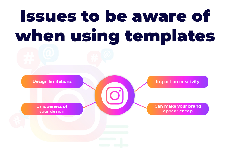
Although there are plenty of reasons that it is a good idea to use a template or two, there are just as many reasons to be careful about how you use them. If you wholly rely on templates for your Instagram Story, or your feed posts, you’re likely to encounter some issues. Although these challenges shouldn’t stop you from using your templates altogether, you should be at least aware of them so that you can avoid them becoming a problem.
Design limitations
By just using templates, you’re going to be limited in the design work you can do to customise each post. Sometimes you’re going to want to use a different design. By having a number of templates available this may become less of an issue, but bear in mind that your Instagram followers are almost certainly going to notice a pattern if you don’t mix it up a bit.
Uniqueness of your design
If you’re working with templates that have been created by someone else and that are made available for absolutely anyone to use – such as those available through design platforms – you’re likely to notice other accounts using the same template. And if you can notice this, your followers are likely to as well. That can be the case even if you’ve made the template your own by changing the colours and fonts so they are on-brand. You can combat this issue by designing and creating your own templates – but as we already said, just be aware of using the same template too regularly, even if you created it yourself.
Impact on creativity
While your Instagram templates are almost certainly going to make it easier for both you and your team to create your posts, relying on them too much will eventually stop yourself and your team members from coming up with something new once in a while. Consider setting a target for a certain number of original posts each week, so that you can keep your creativity going. If you’re a team of one, this might not be a possibility every single week, but when you can, keep creating – if for no other reason than our next concern!
Can make your brand appear cheap
If you’re using templates all the time – especially ones that that have been made available as free for anyone to use – there is the risk that your brand could start to look cheap. Followers may begin to assume that you’re not investing in your design work. Although you can absolutely customise those templates, be careful not to rely on them completely – at least without switching it up here and there from time to time.
How do successful brands use Instagram templates?
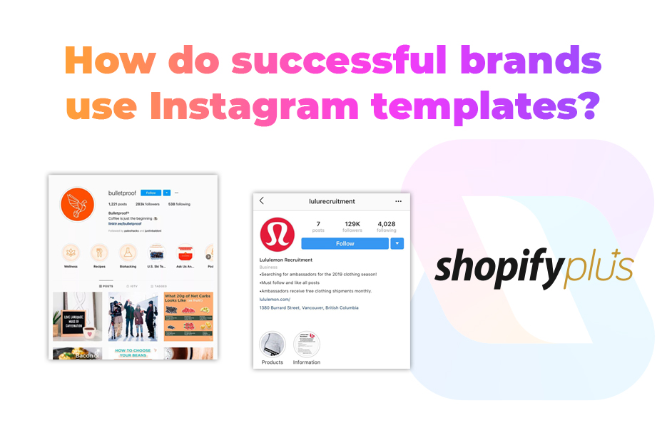
Many of the major household name brands that are posting on Instagram with templates are doing so for the same reasons small businesses do! They’re using them to encourage sharing of their posts – especially when they are sharing inspiring quotes, or they are posting beautiful, aspirational photos.
Let’s have a quick look at how some major brands are using Instagram templates in their feeds:
Bulletproof
The Bulletproof brand is well known in the US for supplying health goods, coffee and food supplements. They have built their brand successfully by creating amazing content marketing that can really help you to get in shape – and their use of their Instagram feed demonstrates just how well their templates work, even when they switch up the colours.
Their feed is instantly recognisable as belonging to the brand. They use a great mix of photos of their products, healthy (but delicious-looking) recipes and quotes, as well as acknowledgements of the holidays and events that you would expect an inclusive brand to recognise, such as Mother’s Day (on the day the US celebrates it!) and Pride month, as well as a ‘happy holidays’ in December.
Their posts that use templates are simple and clear – in keeping with the brand’s ethos for their health goods and food supplements. The use of white on orange and white on green make the message stand out, and is completely in keeping with the colour palette that the brand has opted for.
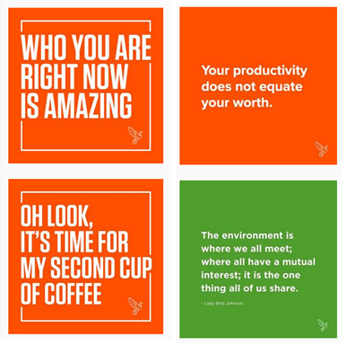
While you’re having a look at their feed for inspiration, notice how they’ve created their Story Highlights – they are all fronted by their recognisable orange hue, with a simple design to help demonstrate what the posts are about. A great way to keep all those posts on-brand.
Lululemon
Another brand that places a huge emphasis on health matters (which makes sense since they sell workout gear!) Lululemon has created way more than a fitness clothing empire. Between their community, their YouTube workouts and their events, the brand has a huge following worldwide, and there is no surprise that their Instagram account for the US has amassed over 3.3 million followers.
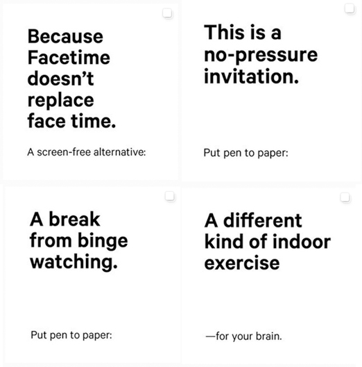
During the COVID-19 lockdown, Lululemon have been encouraging their followers to take up journaling – staying healthy mentally is more important than ever, and our mental health can quickly impact on our physical health after all! Although these are incredibly simple templates, we see the effect they are managing to create. Sometimes keeping your templates simple is exactly the right thing to do to make a statement, and this is a perfect example of that.
In this case, black and white is used to great effect – it reminds us of how striking newspaper headlines are when they are in black and white, and writing is often done in black and white. These posts really stand out amongst their colourful and aspirational (yet that feels completely attainable!) feed. How successful this campaign has been we don’t know, since Instagram has removed the ability to see the total number of people who like a post, but let’s just say we had to scroll a pretty long way through the number of people who liked the post, and we didn’t get anywhere near the bottom of the list!
These templates also remind us a lot of the Cards Against Humanity design – and considering many of the Lululemon target market are going to have played (or at least be aware of) the game, this is no bad thing at all, since it will inspire people to swipe through to see the other images in that post and find out more.
Shopify Plus
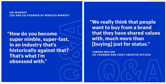
If you’re looking for a great example of how you can use graphic designs that aren’t photos, you can’t go wrong when you take a look at the Shopify Plus Instagram feed. As we write this post there are a lot of posts that are made up of quotes – and it is clear where templates have been used. They have only 84 posts – compared to the almost 3,000 posts that make up the regular Shopify feed – but we think some of these posts are ideal for inspiring your own non-photographic posts, either for your Instagram Story, or for your feed.
The key here is that the Shopify Plus team are mixing up their templates, in keeping with our advice – so although it is easy to tell where the same templates have been used, it doesn’t get boring, which is essential for keeping your followers engaged. The other thing that is great about the Shopify Plus Instagram feed? Everything is highly shareable – and we’ve seen more than one of their posts that has been pinned to a board by a Pinterest user. Since Pins never get deleted, that’s a great way to ensure your posts live on!

Instagram templates
Since we’ve seen how impactful a template can be in your feed (and we haven’t even touched on your Story posts!) you’re almost certainly ready to look at the options for Instagram templates. Luckily, there are plenty of choices – from using templates that Instagram created, to using templates that third parties have created, to (of course) creating your own.
Creating your own Instagram templates
By having your own on-brand templates available, you will always have an easy way to create your posts – whether you’re rushed off your feet or not. Here are a few ideas for templates that you can create to have on hand when you need them:
New post announcements
Whether you’ve just posted on your Instagram feed, you’ve made a new blog post live on your website or you’ve created a new YouTube video, announce it on your Instagram Story quickly and easily with a new post announcement template. You can even announce new posts on your other social media channels this way! Many Instagram users are switching their focus mainly to watching Stories these days, and because of that, it is well worth announcing when you’ve posted to your feed, to encourage them to tap through.
Shoutouts for your favourite customers
Have you had some amazing feedback from customers this week? Perhaps you got a review that blew you away, or a social media post that massively helped to increase your brand awareness. When you’ve received that fantastic love, give it back to keep it growing! Tagging the person (or people) in your posts will help you to show them that you value their feedback and they in turn, are more likely to think of your brand positively in future, and keep promoting your brand for you.
You might have encountered a tricky situation with a customer that ended well as a result of your customer service – if they showed you patience and understanding, be honest with your followers. Sometimes even the best businesses get things wrong, and being upfront about your mistakes, and showing that you’re grateful to those customers that bear with you is a good way to increase trust. Potential customers will see your honesty – and your dedication to resolving issues, which will make them much more likely to convert to a paying customer.
Company news or updates
Maybe you’ve just taken on an amazing new person for your team, or you’re moving premises. Perhaps there’s something else that your team is excited about, like a nomination for an industry award (we’ve had a few, and a couple of wins, so we know the excitement!). Whatever you want your followers to know about your company, having a template ready means you can get that announcement out quickly, so as many people know about it as possible.
New product launch announcements
In DropShipping, it is really easy to add more products to your store – especially if you’re using Avasam and you have a range of verified suppliers to choose from! If you’ve got plenty of followers who are loyal customers, then you’ll be looking to make them aware when you’ve just added a trending product to your store, or a new product that they might not know about yet.
If you’re switching your products on a regular basis, you might not want to update followers about every single product you’re adding, but having your templates ready to go means you can pop an announcement in your feed or your Story pretty quickly.
Invitations to events
If you’re holding a sale, either online or in store, or you’re going to be in attendance at a summer fair or Christmas market somewhere – let your followers know they’re invited! Perhaps you’re going to an industry event where you’re going to be making new connections, and you’re going to be posting throughout on your Story or even going Live while you’re there. Let your followers, and customers know, and invite them to join you quickly and easily with an invitation template.
Tips for creating a great Instagram template
You don’t have to follow all of these tips – but they should help you to create some great templates that really help you to stay on brand, keep your followers interested, and to help your Instagram followers become paying customers.
Keep colours and fonts similar
One of the main reasons that you’re posting on Instagram will be to increase brand awareness. By creating your templates in keeping with your branding, you’ll help reinforce the way your business is perceived. If your brand uses a distinct font, it’s a good idea to use those on your templates so that your posts are even more on-brand.
Use similar layouts
Choosing how Instagram posts – either feed posts or Story posts – are going to look ahead of creating your templates will make everything a lot easier. Using a similar layout on each of your posts means that your followers will come to recognise your posts as being from your brand, which is likely to encourage them to pause their scrolling and actually read your Instagram caption. You might choose a certain font, always using your logo on your posts, or you might add a border that helps make each post that you create stand out as yours at a glance.
Make your posts feel interactive
There are loads of ways that you can get your followers to feel involved with your Story posts. Instagram have already provided plenty of stickers that you can add to posts! Think about adding location stickers if you’re at an event, a hashtag to help your post be found more often, use a mention to tag someone, add a GIF, a Q&A box or create a poll. You’re probably not going to want to put all of those options on every slide, but having at least one can help you to keep your followers engaged.
You can use these stickers to help make your posts feel more on-brand, even if all you change is the colour of your background and the font of your text – so get familiar with the Instagram editing tools.
Templates created by Instagram
Instagram have provided eight templates that you can customise and use for your Story posts. You can find these by opening the Instagram app, then tapping the camera button or swiping right to open the camera. Swipe right at the bottom of the screen to find the Create options, then swipe left across the button to select Templates. Once you’re here, you can tap the dice icon at the top of the screen repeatedly to be presented with the following options:
- What am I listening to?
- Quote of the day
- This track gets me
- Woke up like this
- Top three accounts to follow
- What am I watching?
- Pizza toppings ranked
- Quick draw challenge
These are essentially images that you can put your own text over and customise, in order to make a really quick post when you’re busy. Clearly, they are themed, and probably won’t be ones that you want to use all the time, but they are easy to create and good for a quick post for your Instagram Story in a pinch.
They’re not the only tools Instagram provides in the Create screen though. You can use the Shoutouts template to send happy birthday, thanks or happy anniversary wishes to someone, use the ‘ask a question’ option, polls, countdowns and quizzes in your Story posts. All of these are simple for both you and your Story viewers to use, and they are a great way to build interactions with your followers.
The thing to bear in mind that absolutely everyone has access to all of these templates and functions. They might be customisable, but they won’t always look on brand, so you might decide to only use these now and again – perhaps for when you’re stuck for content – so that your followers don’t get bored of seeing them too often.
Instagram template packs
Considering the popularity of Instagram templates, it probably comes as no surprise that designers are creating packs of Instagram templates and offering them for others to use, either free of charge, or as paid bundles. Creative Market is a great place to start – they have more than 7,000 templates available for Instagram. Prices on Creative Market start at $2, and at the more expensive end of the range you’re looking at over $80 or more. Of course, many people and businesses will want the less expensive options (especially new businesses!) so you’ll need to be aware of that.
If you’re looking for free options, then you can find them pretty easily – Freepik has plenty, and there are absolutely loads showing if you search on Pinterest.
Apps and programmes to create and source templates
There are a range of formal design packages – such as Photoshop, open source alternative Gimpshop or one of the many others that are available. If you’re proficient in using one or more of those packages, then you’re probably already set – and it is pretty likely you don’t even need to read this post!
Unfortunately, we’re not all blessed with the ability to use Photoshop or similar packages – and many of us aren’t even blessed with the time to learn how to use them! If that sounds like you, then you need one of the many design tools that feature drag and drop functionality to make things easy, so that you can create your posts in next to no time.
You might need to know the dimensions you need for Instagram Stories are 1080 x 1980px – but in reality, most of these design tools will have template outlines that allow you to simply select the template you want to work with and get cracking.
Canva
We’ve mentioned Canva on the Avasam blog pretty regularly – but for very good reason. As a writer with very little artistic ability (I can barely draw a stick-person!) Canva has been a lifesaver on many an occasion since I discovered just how incredible it can be a few years ago. It’s a graphic design platform that makes creating amazing graphics – for almost anything – simple and straightforward.
The Canva platform has templates for almost everything that we can think of – and it is all done using drag and drop. Using Canva means you won’t need to worry about remembering the dimensions – for both your Instagram Story posts, and your Instagram feed posts, or for any other type of social media post that you decide to use Canva to create. It isn’t just social media posts that you can create on Canva though – there are document templates, presentations, and invitation templates, amongst a whole lot of other options. You can even use Canva to create animated videos –including specific sized videos for your social media posts.
You’ll be able to customise absolutely everything about your templates, and your posts, from fonts to backgrounds, frames, graphics and photos. They have photos and images that you can use – both free and those that are available to Pro users, or you can upload the images that you have created yourself.
If you want to keep everything even more consistent, you can add your brand kit to your Canva account, and you’ll be able to access these whenever, and wherever you’re creating your Instagram Story posts, and your Instagram feed posts.
Canva is available in browsers on desktops and as an app for mobile devices, so you can create your templates on the go too, and you can have members of your team log in and share work, so there are opportunities for collaboration, or approval when necessary.
For more examples of how you can create great graphics and templates that work fantastically both on your Instagram feed and on your Story, follow them @canva
Adobe Spark
Adobe Spark is an integrated suite of apps that allow you to create all your social media graphics, as well as short videos and web pages. With Adobe’s history of providing in-depth, complicated to learn design tools, you might assume that Adobe Spark would be tricky to use, but it really isn’t.
Once you’ve logged in (that you can do with a range of IDs that you already have, including Google, Facebook or Apple accounts) you’ll find there are thousands of templates that you can use for your Instagram posts. Much like Canva, all you need to do is to search for the template you’re looking for (‘Instagram Story’, for example) and you’ll see an incredible array of options. Some of those templates are available to Premium subscribers, but Adobe have made it clear which ones are chargeable with a little yellow marker on the corner of the preview, so you can easily opt for free templates if that is what you’re looking for.
Adobe have also made it easy to find stock photos for your post – so if you don’t have time (or the ability) to take your own photos, you can still create a professional look by editing the template with one of their images.
Again, like Canva, you can create your own templates using Adobe Spark. Simply click Create Project to start work on your design. The one downside to using Adobe Spark is that your posts get published with the Adobe Spark logo on them unless you pay the subscription fee – but that’s just £10.10 per month, with 2 months free.
You can work with Adobe Spark in your preferred web browser, or you can download the app for your mobile device, so you can access and work on your designs anywhere.
Easil
Just like Adobe Spark and Canva, Easil is another design platform that can help you to create your marketing assets, including your Instagram posts.
There are a range of really useful features on Easil, from removing backgrounds from photos with one click, to adding animated GIFs, and using different text features. One of our favourite options is their resizing tool for social media posts – which is incredibly useful if you’re going to need to create similar posts for across all your social media channels.
If you’re working with a team that are keen to put their own stamp on your social media templates but you aren’t so keen on their efforts just yet, you can lock parts of your designs using Easily, which means you (or your brand manager) can keep tabs on them.
Easil Plus offers all the enhanced design ability that you might need at just $7.50 per user, per month (with 30 days free when you sign up), but even the basic plan allows you to create great designs. The downside to Easil? There doesn’t seem to be a mobile app available at the moment, which means you’re tied to your desktop PC to create your posts. Depending on how, and where you work, that might be an issue – if not now, then potentially in the future. We’ll keep our fingers crossed they launch their mobile app soon.
The ‘Instagram aesthetic’
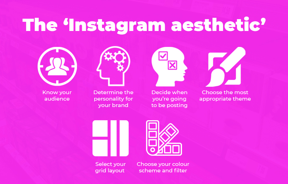
Although the Instagram aesthetic isn’t strictly anything to do with a template, it is a useful thing to think about to help guide your posts, which is why we’ve included it here. The Instagram aesthetic emerged shortly after the platform launched, and has been a hot topic for debate ever since. It is simply about how your feed looks and feels, as well as whether you keep your Story posts to the with the same look and feel or you use your Story for less polished, behind the scenes content. Essentially though, it is about ensuring your pictures feel similar, and ‘on brand’. You might use certain fonts, specific colours and filters to create the look you want on your Instagram feed, and you might decide to always feature (or hide!) a certain item in your posts. For example, if your business has a mascot you might always add that in. You might edit it into your post, or you might have a stuffed toy of your mascot, and decide to put it into each photo you take.
There are a number of things you’ll need to do to create a cohesive feed:
Know your audience
You’ll almost certainly have a certain type of person that you’re trying to reach on Instagram – because it is exactly the same people that are your target customers. You will have done a lot of research to determine exactly who your target customers are before you started your business. If you’ve done your research well, you should know your target customers inside out – what sort of look appeals to them, what will make them want to buy your products and so on. By knowing your target customers intimately, you’ll be able to create Instagram posts (both on your feed and on your Story) that really appeal to them.
Determine the personality for your brand
Brand personality is something that marketing teams decide on to help customers get a feel for the company. For example, a brand that are selling medical supplies will need to build trust by appearing knowledgeable and qualified, whereas a company offering children’s party supplies might need to come across as fun and innovative.
Your aesthetic will need to impart the sort of image you want to project, so decide on the fonts and colours you’re going to be using – if you’ve already created brand guidelines, then this bit is easy. If not, then here are a few questions to help you to establish your brand personality:
- How do you describe your brand in just a few words?
- What are the main types of posts that you’re going to be creating?
- What sort of visual theme suits your brand?
Decide when you’re going to be posting
You’ve probably already worked on a schedule for your Instagram content, and even if you haven’t, you probably have an idea about roughly how often you’ll posting. You might choose strategies according to how often you’re posting – for example, if you’re posting three times weekly, you might have a theme for each week, so that you’re featuring a certain product on each row of your grid.
Choose the most appropriate theme
Choosing a theme might mean that you choose the subject matter that you’re going to be working with, or the niche you’re going to be targeting. You might also utilise a certain composition, or patterns in your posts. How will the theme you pick contribute to your business? If you’re selling homewares, you might decide to always include a certain type of flower alongside your photos and flat lays. If you’re an outdoor apparel or equipment specialist, then you might decide not to have a theme apart from all of your photos being from outdoors.
You might always include certain colours, or a certain shape – it is all up to you. And remember, you’re not tied to anything, so you can always make changes or switch tactics whenever it feels appropriate to do so.
Select your grid layout
Instagram posts aren’t just about each individual post – they are about the bigger picture. Taking a moment to decide how your grid will flow will help you to keep things on track.
Your grid layout is simply how you’re going to position the posts in your feed. You might decide to take turns featuring product images and lifestyle images – your products in real life. Otherwise, you might consider switching between photos and quotes with solid backgrounds, changing the colour of your images so your feed changes as you scroll through.
You can also split photos into tiles to make your photo spread over 3, 6 or 9 tiles on your grid, which make it even more impactful. Use an app like Pic Splitter, Tile Pic, or Instagrid to create this effect – and of course, you’ll need to plan for these posts, since you’ll need to maintain the alignment. Don’t forget though, each section of the photo needs to be visually striking, and interesting enough to stand alone when followers see it in your feed.
Choose your colour scheme and filter
When you’re creating your feed and you’re creating your aesthetic, one of the first things you need to do is decide on a basic colour scheme. Will your photos be brightly coloured and feel fun, or should they feel more moody, using cooler shades? If your products have a vintage feel to them, perhaps you’ll use black and white or sepia tones for your cover photos on your feed, and have the colour versions available to swipe through to. The possibilities are endless here too!
You can use filters to quickly edit your photos so they suit your colour scheme, which allows your photos to all look similar hues, but you will also need to consider your lighting in the photos. Whether you always shoot your pictures outdoors, or you use a ring light to keep everything looking similar, it is a simple trick to help maintain your aesthetic.
Do you have to create an aesthetic?
There is a huge amount of discussion and debate around whether we should all still be creating an aesthetic or simply posting what we want to post as we move into the early 2020s. Many influencers are now actively avoiding creating such perfect shots, shunning the DSLR cameras that used to be thought of as essential and even ignoring the need for photo editing. All this adds up to a much more organic and so if creating a perfectly coordinated feed is not something you feel fits your brand, you don’t have to. Just be sure to do your research, and that whatever you decide, is going to work for you.
Instagram templates can be an incredibly useful addition to your strategy, especially when you’re in the midst of a busy period. Templates can dramatically save you time and energy while keeping your branding consistent and increasing brand awareness with your followers.
Our main points of note to take away:
- Creating your own Instagram templates doesn’t need to involve Photoshop – there are plenty of design platforms that can help you create your posts quickly and easily
- Your templates can be incredibly simple – especially if you’re not using photos as the focus of the posts. Remember how effective that black and white Lululemon one was?
- Creating your own templates aren’t your only options – you can get template packs, and both paid-for and free options are widely available
- Be aware of the issues that could occur from the over-use of Instagram templates – you don’t want to stifle creativity with your team, or to have your followers think you’re not interested in them
- Don’t forget about the aesthetic that you’re looking to create for your feed when you’re creating, or working with Instagram templates. The bigger picture of how your feed looks and feels is still pretty important
While you’re posting on your Instagram account, don’t forget to give us a follow – we’re @avasamsocial on all the social media platforms!
This post contains affiliate links. If you use these links to buy something, we may earn a commission. We only use referral links for businesses that we would use ourselves. Thanks for your support!



DropShip products from verified suppliers to diversify your inventory and scale your eCommerce business